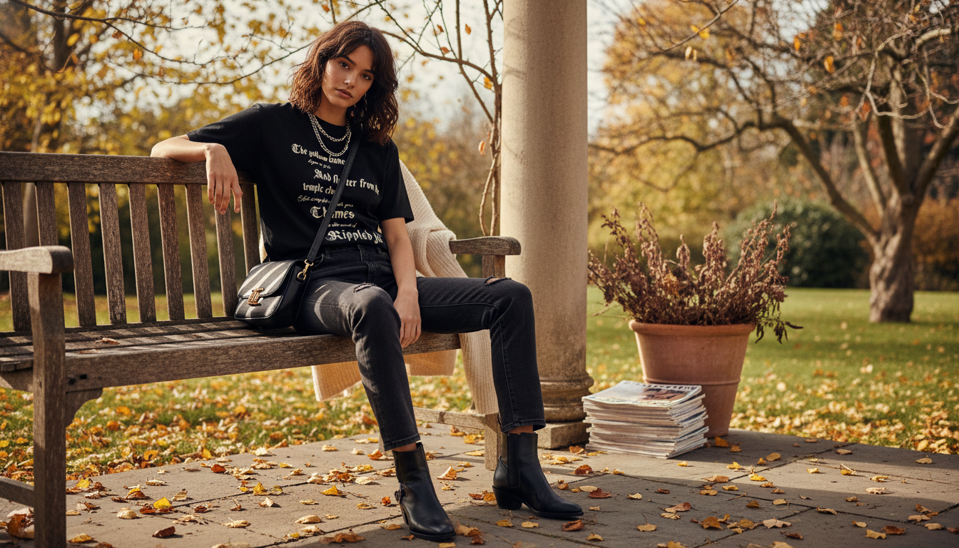
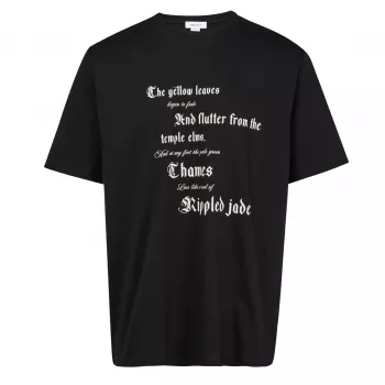
A clean cotton base meets a bold, contrasting maxi print for a look that reads modern, graphic, and unmistakably statement-driven. This T-shirt style is designed to anchor outfits with minimal effort—easy to wear on its own, sharp under layers, and strong enough to carry a full look around a single striking motif. If your wardrobe leans streamlined but you still want something with impact, a high-contrast designer graphic tee is one of the simplest ways to add energy without overcomplicating the rest of the outfit.
The appeal is the balance: the base stays clean and wearable, while the print does the heavy lifting. That combination makes it easy to rotate through different settings—casual daytime, travel, or a polished night look—simply by changing the pants and shoes.
| Look | What to pair it with | Why it works |
|---|---|---|
| Everyday casual | Straight-leg jeans + low-profile sneakers | Keeps the graphic as the main point while staying relaxed |
| Smart casual | Tailored trousers + loafers | Balances the streetwear edge with polish |
| Layered city look | Overshirt or bomber + tapered pants | Adds depth while letting the print peek through |
| Minimal monochrome | Black or white separates + tonal accessories | Amplifies contrast and looks intentional |
To keep a maxi print looking elevated (not chaotic), treat it like you would a statement jacket: let it be the loudest piece, then keep everything else calm. If the print includes multiple tones, repeating just one of them—say, in a sneaker stripe, cap, or outerwear—makes the outfit feel designed rather than accidental.
Because the print is the centerpiece, the tee should hang smoothly through the upper body. Too tight and the graphic can warp; too oversized and the design may fold or disappear under layers. A reliable checkpoint is the shoulder line: if it sits just at or slightly past the shoulder edge, the tee typically reads modern without looking sloppy.
Comfort is more than softness. A cotton jersey that has a bit of substance helps the shirt keep its outline, especially under outerwear. That structure matters with high-contrast graphics: when the fabric lays flat, the print reads crisp and intentional; when it clings or twists, the same print can look distorted. Also pay attention to the collar ribbing—firm rib knit is a subtle but meaningful indicator that the tee will keep its shape across repeated wears.
| Step | Best practice | What it helps prevent |
|---|---|---|
| Washing | Inside out, cool water, gentle detergent | Fading and surface cracking |
| Drying | Air-dry or low heat | Shrinkage and print distortion |
| Ironing | Inside out or with a pressing cloth | Gloss marks and print damage |
| Storage | Fold with print area flat | Creases through the graphic |
Always follow the care instructions on the garment label. For additional context on labeling requirements, see the FTC Care Labeling Rule. If your label uses care symbols, the GINETEX textile care symbol guidance is a helpful reference.
Aim for a classic-to-relaxed fit so the graphic sits flat across the chest without warping. If you plan to layer, a slightly closer fit can work; for a streetwear silhouette, go roomier with a clean shoulder line and a hem that hits around the hip for easy tucks.
Wash it inside out on a cool, gentle cycle with mild detergent and avoid high heat. Air-drying and skipping direct ironing on the printed area help preserve contrast and reduce cracking over time.
Neutral bottoms and understated shoes keep the print as the focal point. For a smarter option, pair it with tailored trousers and loafers, then repeat one color from the graphic in a jacket or accessory to tie everything together.




Leave a comment